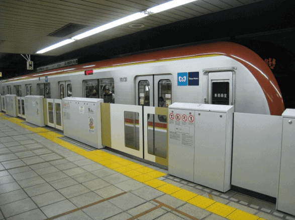
I am just weeks away from a long-anticipated second trip to Japan. And despite all of wonderful things the country has to offer, I am most excited to use Tokyo’s rail network once again.
It’s a dream world where people line up in queues and wait for everyone to get off before getting on a carriage. Trains stop in the same location every time so you know where to wait, and if the train is packed you simply say ‘excuse me’ and everyone gets off to make way for you.
Challenges faced by the everyday train passenger in Melbourne
Living in Melbourne, we have to deal with out-of-date signalling technology, a limited number of trains, pushy commuters and long travel distances. These are all things that we’d love to see change. Spanning infrastructure and culture, Tokyo’s entire train service and commuter experience is what really makes it shine.
How the rail networks differ
Look at the train network maps of the two cities. At first glance, Melbourne is the clear winner in terms of simplicity. But if you look closer, you will start to see how user-friendly the rail network in Tokyo actually is.
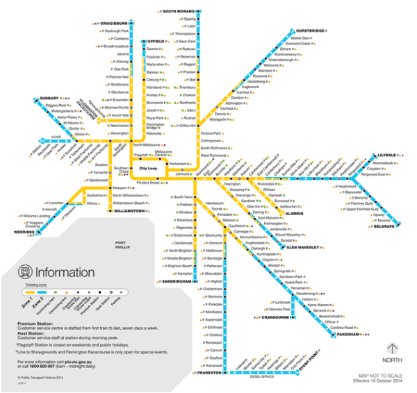
- Melbourne has confusing concepts like Zone 1 and Zone 2 (and a host of other confusion with Myki). The colouring of these zones could make it look like all of the train lines in yellow are connected and no interchanges are required. This can mean you arrive on a train to Flinders Street station and it suddenly changes to a completely different service.
- Melbourne labels their train service by the last stop made on that trip. That means if you didn’t realise that the Hurstbridge service is also the same service as the Eltham service then you will miss your train.
- You have to count out how many stops there are on your journey and remember the station name.
- It’s not clear which train lines are offered at each station. Flagstaff station is right in the CBD but it looks like it is only connected to the city loop service.
- It is a nightmare trying to figure out which direction the city loop is traveling in at any given time of the day without looking at the announcements at each station
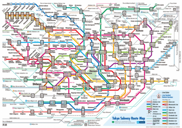
- Train lines are colour coded to help identify both which train you should step on at the station and where the train will travel to on the map.
- Train lines are designated a single name for all services on the line and this is shortened for convenience to identify individual stations.
- You can either remember which station you need to get off at by the station name or by its position on the train line – Akihabara Station H15 (Akihabara Station is the 15th station on the Hibiya Line).
- Each station also has its own jingle which plays in carriages upon arriving to help alert any sleeping travellers that they have come to their stop.
- Each station on the map easily identifies which train lines are available from its station.
- The use of numbers on stations makes it super easy to know which direction you are traveling in.
It is just impressive that an English speaker can even use a foreign language train system intuitively. All the great attributes of Tokyo’s rail system are not defined by its underlying technology, but by the overall user experience offered when commuters use it. (That being said Melbourne’s underlying technology could also do with a change…)