It’s 10pm, pouring with rain and your car’s broken down on the freeway. Lucky you’ve got emergency roadside assistance and help is just a phone call away. Or is it?
For many people, an investment in roadside assistance is well worth the couple-of-hundred bucks each year for peace of mind. But when it comes to the digital experience of buying roadside assistance, how do the various service providers stack up?
A recent global review we did for RACV looked at the user experience of shopping for roadside assistance on several provider websites. Tim Case, RACV’s UX Specialist, Digital and Member Experience, explains his company’s rationale:
RACV wants to benchmark our online service. Gone are the days of simply comparing competitor products and their pricing – we need to be able to compare experiences to ensure we continue to deliver optimal online experiences in tune with our users’ expectations.
This article explores a few of the ‘gotchas’ we found in our review of RACV competitors and shows that customers don’t always get what they bargain for when buying roadside assistance on some websites. Of course, these issues aren’t unique to roadside assistance products – as UX specialists, we come across them on all kinds of retail and service websites.
Customers don’t always get what they bargain for when buying roadside assistance on some websites.
Poor design or dark patterns?
While some companies don’t plan to annoy users with a frustrating experience, others may intentionally use misleading design (also known as ‘dark patterns’) to funnel prospective customers toward conversion. Dark patterns are designs that consciously take advantage of users’ tendencies to scan and skim online instead of reading in detail, thereby tricking them into actions they may not necessarily want to take.
User Experience Research and Design Consultant Harry Brignull has dedicated his website to outing companies who use dark patterns. He describes the strategy as “making a page look like it is saying one thing when in fact it is saying another.”
Intentional or not, companies can alleviate a lot of pain – and get happier customers – by thinking carefully about the user experience, and designing with customers’ goals and satisfaction top of mind.
Here’s four common issues we found when reviewing the experience of shopping for roadside assistance on a selection of sites:
1. Misrepresenting the product offering
At first glance on youi, it looks like you just click the big green button to get a quote for roadside assistance. Too easy. But did you notice the product is only available as an optional extra with comprehensive car insurance?
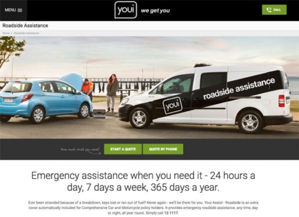
Without reading the fine print (and who does), users may waste time and effort working through the purchase process before discovering their error. Some users may not even realise they are getting a quote for the wrong product.
Users may waste time and effort working through the purchase process before discovering their error.
By burying the facts, youi is providing a frustrating experience that risks losing prospective customers for future sales.
2. Hiding exclusions
So, you’ve done your research, compared roadside products and you’re ready to purchase. But now the form tells you that your car is too old to cover. It would have saved a lot of wasted effort if 365 Roadside Assistance had told you this in advance.
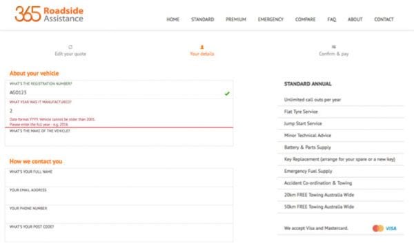
It wouldn’t take much for 365 to flag in product descriptions that cars older than 2001 are not eligible for cover. While 365 at least displays an inline error to alert users early in the purchase process, another website we reviewed left users struggling to find their car’s year of manufacture in the available drop-down options.
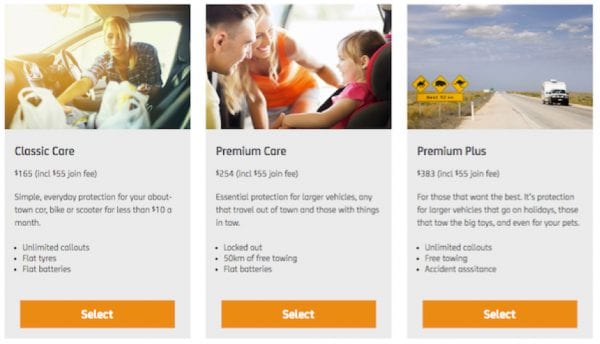
3. Allowing users to compare products
In our user interviews for RACV, the ability to compare product options was a consistent top task when purchasing roadside assistance. So why would some companies make it difficult for customers to compare apples with apples?
NRMA presents an overview of its three products but doesn’t provide any side-by-side comparison of the product details. Users need to click between separate pages (and make their own notes) to make any comparisons:
Compare this approach with RACV, who puts a detailed product comparison table front and centre on the landing page:
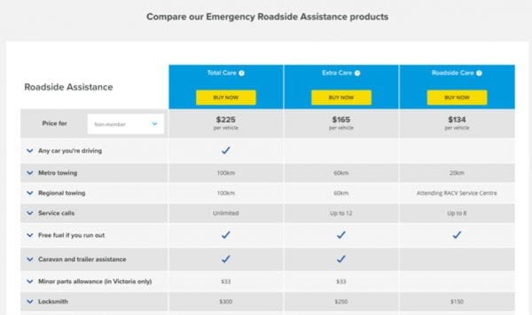
Providing a comparison chart, or just listing out product features on the same page, makes it easy for users to see what they are getting when items are bundled together and helps them make an informed purchase choice.
In contrast, intentionally or inadvertently stopping users from comparing their options is misleading, and puts up barriers to achieving important goals.
4. Inconsistent and unresponsive design
Anecdotally, our research projects consistently find that users prefer desktop PCs or laptops when shopping online, and this is backed up by KPMG’s 2017 global study, The Truth About Online Consumers. However, there is still a high percentage of users who purchase products with their smartphones and tablets and companies risk losing sales if their purchase experience is not responsive to a range of platforms and devices.
Budget Direct has a strongly branded entry page with clear product descriptions and calls to action. But clicking to the purchase form feels like you are going to another, older website that’s clumsy to use, especially on a mobile device.
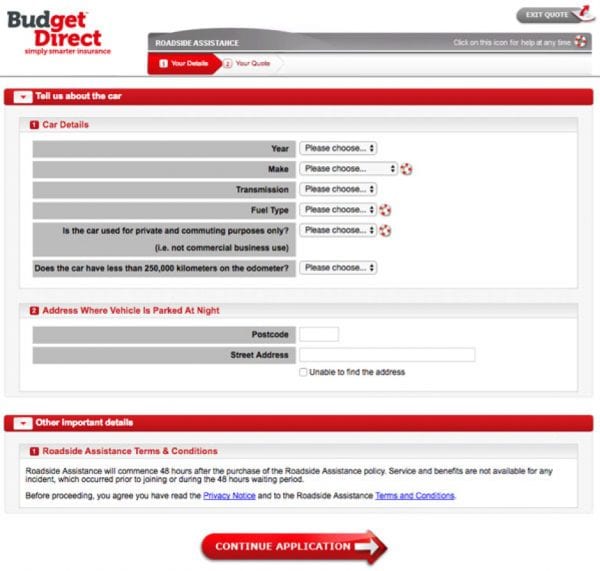
Users expect a consistent end-to-end online experience so when they move from a slick, modern product page to a dated, difficult-to-use form it doesn’t take much to sway their confidence and have them bail from the purchase.
Improving the user experience
RACV takes its user experience seriously and undertakes regular research, such as this global review, to understand how users research, find, purchase and use its products. Tim Case explains his company’s approach:
“As our members interact more and more online, in order to continue growing our membership base and adding value to existing members, we must engage in user research. We can hypothesise about how our users interact with our digital landscape, however nothing can replace user research as it allows us to gain direct insight into how our customers think and act. Moving forward, RACV is embracing the Human Centred Design process with all digital projects with the aim of placing members’ needs at the forefront of decision making.”
Improving the user experience requires an ongoing commitment to observing and listening to users to see what they need to complete a task and what’s getting in the way of achieving it. Whether through poor design or a more strategic use of dark patterns, companies may be inadvertently pushing users further from their goals and, ultimately, losing business.
With more focus on user research, these pain points can be removed or alleviated, providing not only a better experience but happier, more qualified and loyal customers.
Screenshots used in this article:
www.youi.com.au/roadside, accessed 26/07/2017
buy.365roadsideassistance.com/plans/standard-annual, accessed 26/07/2017
www.racv.com.au/on-the-road/roadside-assistance, accessed 26/07/2016
www.mynrma.com.au/cars-and-driving/roadside-assistance, accessed 02/08/2017
www.budgetdirect.com.au/roadside-assistance-australia.html, accessed 26/07/2017